Tesla brand strategy
Realigning the company to its mission
Imagine electricity being harvested from people’s kinetic energy expended on the floors as they walk to the metro. The technology is already available. Imagine collecting friction energy from all the moving trains in NYC. Imagine this power feeding right back to run the trains, elevators, and lights in a metro system. Tesla has already began to provide back-up electrical power for a city. Let’s take it all the way.
Brand Audit and Strategy >
Identifying unique opportunity for Tesla
Visual Design Decisions >
Thought process of the visual brand elements
Tesla’s mission is to accelerate the world’s transition to sustainable energy.
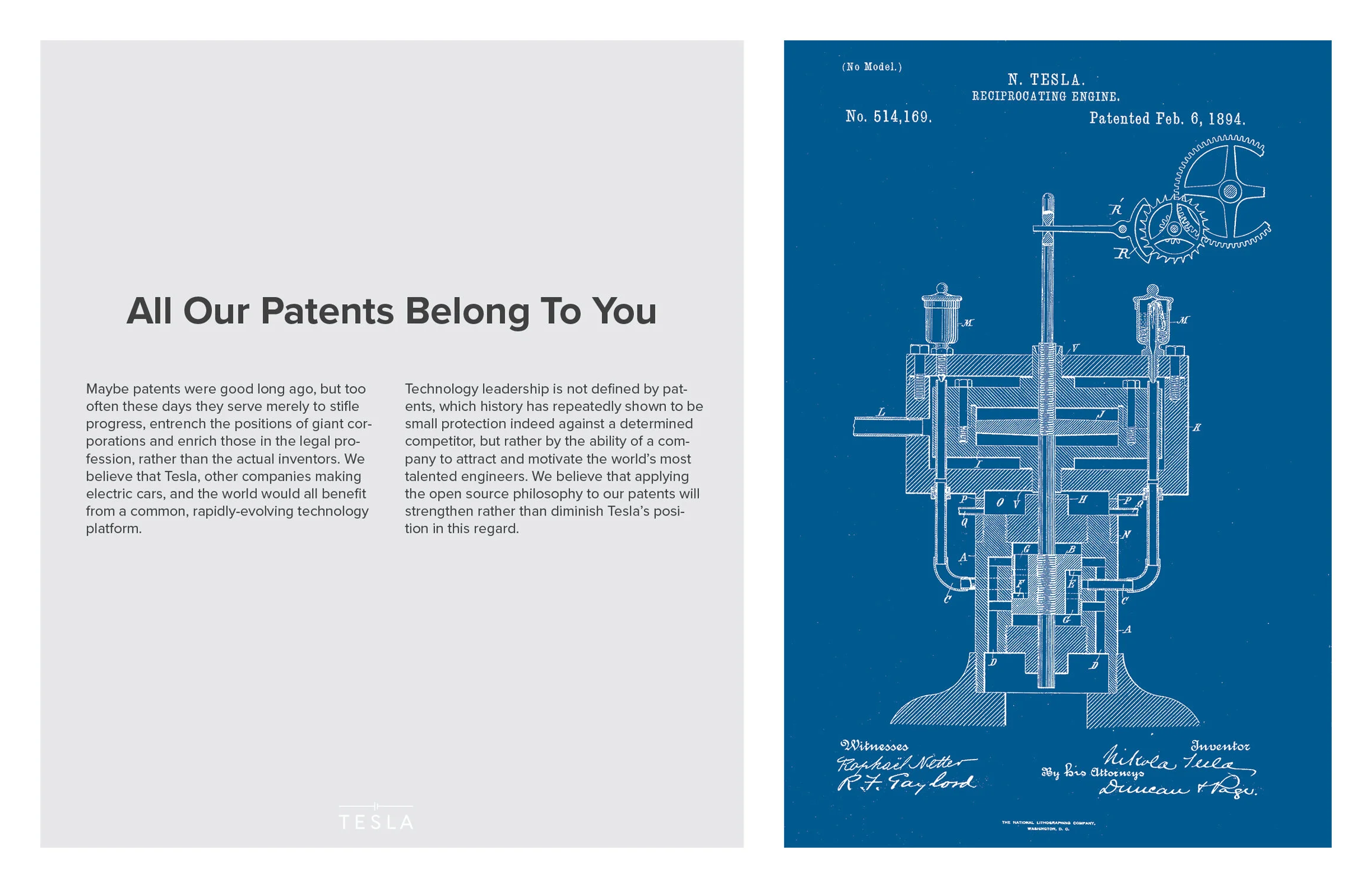
Going back to the roots of Tesla Inc., I took inspiration from Nikola Tesla’s work and his vision for the world to have free electricity.
With so many current attributes, it is necessary to narrow it down to the essentials.
Sustainable: Clean energy generation and zero-emission
Powerful: Powerful, high quality products; Powerful concept in leading the world forward into sustainable energy; Powerful in caring for the future of Earth
High-tech: Cutting-edge technology
Affordable: Not an exclusive line of products for the rich. In fact, you don’t even need to buy Tesla products to take part in transitioning the world into sustainable energy
A brand driver describes an organization in visual metaphors.
I used this tool to solidify attributes for the new Tesla as well as to shape its new brand look.
AESTHETIC ATTRIBUTES
Natural: Earth’s terrain; Sky; Ocean; Mountains
Space: Generous use of negative space in imagery, website, store, typography; Images of the Earth from outer space that invokes feelings of care for the future of Earth and to associate Tesla with space technology
Limitless: Aerial photos that have vast expanse, or elements getting cut off from the edge to hint that ‘there’s more’
I drew inspiration from NASA’s satellite images.
The Earth’s vast and varied lands and oceans incite feelings of how sources of energy can be limitless. Images that show what cannot be seen at eye level is a reminder that it’s not about any one individual. The sustainability mission is much bigger than any one of us.
Blues make up the expanse of the Earth. With its feelings of calmness and trustworthiness, I found blue colors to be the perfect representation of the new Tesla.
I looked for a mark that could speak to Tesla’s desired target audience — the mass market.
The current Tesla logo feels edgy and trendy, attracting early adopter men and sport car drivers.
The new logo is welcoming to Tesla’s desired target audience, the mass market. The new logo symbol comes from the way electricians denote a single battery cell. It embodies electricity and represents energy storage technology.
I chose this symbol because the single battery cell is the foundation for everything Tesla produces.
After playing with some ways the logo mark could become a pattern, I came back around to the electrical diagram concept and settled on this electric network design.
I expanded the electrical symbols into a library of graphic icons that represent Tesla’s technology or ways it harvests energy.
Next, I explored how the graphic icons, photography, and a message could look like together. These are some of the layouts I designed. These did not make the final cut because they are not as appealing as the final solutions with large images and short messages shown in public spaces.
As long as the Sun shines, the wind blows, the rivers flow, and living things move, there is infinite energy.
Typography is clean and airy because the energy Tesla produces is as free and as clean as the air we breathe.
The final design elements come together at public spaces where Tesla's technology is in use.
The campaign is stronger because the viewer can experience Tesla’s technology and be reminded of Tesla’s mission at the same time.


